Do you want to know the best CTA button color to increase your CTR?
Every online marketer knows that conversions are key to success. When more people click on your “Subscribe” or “Buy Now” buttons, you get more leads and sales.
Color definitely matters to online users. In one survey of 500 consumers, 39% said that color is the most important visual element of a business’s website.
But when it comes to the best colors for click here buttons, that’s a highly debated topic.
Can certain CTA (call to action) colors increase your conversion rate?
In this article, I’ll talk about the best CTA button color for websites and emails, based on research.
- What Do Experts Say About Call-to-Action (CTA) Button Color?
- The Basics of Color Psychology
- Does CTA Color Really Matter?
- 3 Tips to Finding the Best CTA Button Color
What Do the Conversion Experts Say About Button Color?
You may have heard conflicting advice surrounding conversion optimization, especially when it comes to color.
Digital marketers agree on some of the most important strategies for conversions:
- Creating a sense of urgency
- Leveraging social proof
- Using clear design concepts
- Finding the right lead magnet
But color? That’s a tricky one.
You might have come across marketers who claim that they have found the “secret” to color optimization. Generally, you’ll see these people belonging to one of three camps:
- The Generalizers: This type of conversion rate optimizer will religiously commit to following general, broad best practices. However, they won’t dig deep into the psychology of their own customers to fine-tune their campaigns.
- The Pigeonholers: This second type swears by very specific strategies. They will tell you that there are certain “secrets” that are guaranteed to increase your conversion rate. They’ll tell you that a certain color, font, or layout is the way to guarantee your success.
- The Perpetual Testers: The third type won’t commit to any strategy. These optimizers have experimented enough to know that some strategies don’t necessarily work for everyone. Instead, they’ll tell you to test out different things, almost at random, until you find something that works.
When faced with the question of which is the best CTA button color, each camp will have a different answer:
- The Generalizers will tell you that there are some general truths about color. Some colors work well for certain industries, and there are some colors that you should never use.
- The Pigeonholers will swear by one color that converts better than any of the others.
- The Perpetual Testers will say that color might make a difference, but not in any consistent or predictable way.
Clearly, they can’t all be right.
Perhaps color doesn’t play a significant role in conversions as we thought. Or perhaps there is something more subtle going on here?
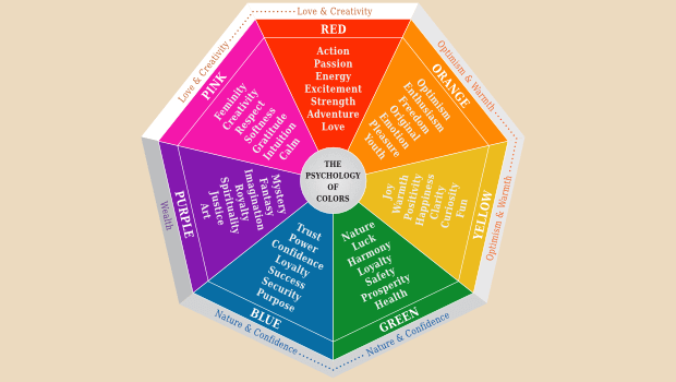
Before we discuss how to choose your website button colors, let’s go over the basics of color psychology
The Basics of Color Psychology (and Why It’s Complicated for Businesses)
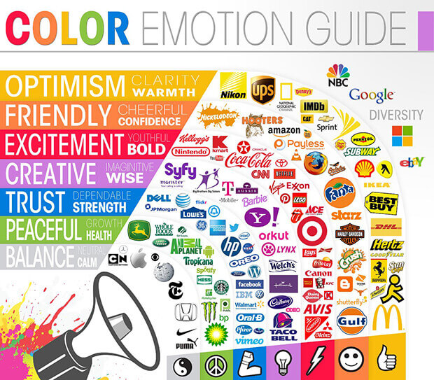
For decades, brands have applied the power of color psychology to their logos and marketing.
The above infographic shows how major companies have chosen brand colors that bring forth certain emotions.
Here are a few takeaways from how top brands choose their logo color to fit their brand personality:
- Orange is often used to show cheerfulness and vibrance, such as the Nickelodeon logo. And of course, to illustrate that the product is orange-flavored.
- Red is the color of choice for bold logos that are immediately recognizable, such as Coca-Cola and Target.
- Blue is used by brands that want you to trust them as part of your daily lives. Or to trust them with very important tasks like home repair or making your medicine. That’s why you see blue in the logos for Walmart, Lowe’s, and Pfizer.
- Green evokes nature, health, and peace. It’s often used to represent fresh food, like the Whole Foods and Publix logos.
Psychologically, there’s no doubt that color can have a profound effect on people. But it’s not as simple as some colors always being better than others.
Here are a few research-backed examples of the power of color. These examples also show that the psychology of color is complex.
- Cognitive performance: The color blue improves performance on complicated detail-oriented tasks and on creative tasks. On the other hand, red can improve performance on more simple detail-oriented tasks.
- Aggression and sports performance: Men wearing red are perceived as more aggressive than men wearing blue or gray. Wearing the color red also improves the chances of male athletes winning in combat sports. However, this advantage is not shown in female athletes.
- Heart rate and blood pressure: Various studies have shown that exposure to red can increase heart rate and blood pressure, while blue and green can lower them. However, it’s debated whether the results are statistically significant.
- Cultural and geographical differences: In general, emotional associations with color are consistent around the world. However, different cultures and countries often have their own color symbolism. For instance, black is universally associated with sadness, grief, and mourning. But Greece also uses purple as a mourning color, while China uses white. One case study on CTA color showed that A/B testing results varied widely based on the user’s country.
What should you take away from this information? That color affects how people feel, but there are many factors at play.
For instance, gender and culture play important roles, and some effects of color may not be very significant.
So how are marketers supposed to make sense of all this? How can you use color to get people to click on the buttons on your web page and in your emails?
Does CTA Button Color Really Matter?
It may seem theoretically possible to choose a “perfect” color: one that’s culturally and demographically appropriate for your buyer persona, and your brand. But that color choice is most important in your overall visual brand, not just your button colors.
Yes, it’s a good idea to consider the emotional meaning of your call to action (CTA) button color. You should also run A/B testing to optimize your website popups and email campaigns.
But let’s say you change the color of your call-to-action from blue to red, and you see an increase in conversions. Does this mean that red always converts better than blue?
Not necessarily.
You see, there is more at play here than just the color of the button itself.
The variables include not only your brand and audience but also the surrounding design. It’s nearly impossible to isolate all of the variables and definitively prove which color converts best.
So does call-to-action button color really matter? Button color is an important factor in getting users to click your links. However, it’s not a matter of some colors always being better than others.
Big corporations have the time and money to do in-depth studies on how consumers react to every single color in their web design.
But thankfully, it’s actually very simple to use button color to increase your conversions.
We’re here to show you how to choose the right color that works best for your business.
3 Key Tips for Choosing the Best CTA Button Color
So what really is the best CTA button color? The best color is the one that works best in the context of your visual brand and the design of your website and email campaigns.
Below, we’ll share 3 simple ways to improve your CTA colors.
1. Your CTA Color Needs to Pop (Contrast Is Vital!)
We know that a more prominent, eye-catching call-to-action results in more conversions. Therefore, any color change that increases the visibility of your CTA button should increase your conversions.
You should focus on two forms of color contract when creating a CTA button:
- Contrast between the button color and the background
- Contrast between the button text and button color
If, for example, your button color is low-contrast against your background color, visibility will be poor.
But, increase the contrast, and boom! Your conversions will go up.
You don’t have to do an in-depth study about the emotional effects of your website colors.
Just make your buttons stand out.
Here’s an example of an attention-grabbing CTA button with high contrast:
The other factor to consider is the overall color scheme of your page. If one color dominates your page, and that color is also being used for your call-to-action, it won’t stand out. To make your call-to-action really pop, again choose a contrasting color. If you have a white background, a bright color or even black is great for catching users’ attention.
In one well-known A/B test from 2011, HubSpot found that red buttons worked better than green buttons. In fact, the red button got 21% more clicks than the green.
But let’s look at the context of those red and green buttons. Quite possibly, the reason red converted better than green was that green was the dominant color on the page. Therefore, red created more contrast:
As you can see, the green button blends in more. The brand’s logo is also green, and there is a lot of green in the screenshot on the right. Plus, the most prominent icon in the features list is also green.
On the other hand, there is very little red on the page. So the red stands out, while still making fitting the page’s color scheme.
In fact, some testing has shown that brands can increase sales by over 35% by making sure their CTA color stands out.
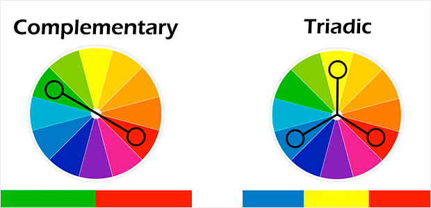
To get the most contrast, pick a complementary color: one that is opposite to your dominant color on the color wheel.
Another high-contrast color is a triadic color: one that is a third of the way around the color wheel from your dominant color.
2. Your Colors Need to Be On-Brand
Your brand identity is another important factor in choosing your CTA colors. If you have a consistent color scheme for your logo, website, popups, and email marketing, your buttons should always fit into that color palette.
For instance, IPSY is a makeup subscription service. Pink is the primary color for the brand. They even use pink padded envelopes to mail their products.
The color scheme of their website and app is pink, cream, and black.
Customers use their app to choose their products each month, and they know to expect these colors from the brand.
IPSY wisely stays consistent with that color scheme in their promotional emails, and the CTAs within them.
Above, the black CTA button stands out from the pink and cream background.
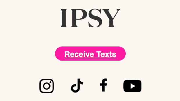
At the bottom of each email, there is a bright pink CTA button to promote their SMS marketing list:
Notice that the color of this button is extremely bold while still matching the brand’s color scheme.
What can you learn from IPSY? Make sure you have a brand color palette and not just a single color. That way,
3. Your Colors Need to Be Consistent
Marketers also use color to make it easier for users and subscribers to find the CTAs they’re looking for.
For instance, you already know that blue text usually denotes a hyperlink. This consistency makes it easy for internet users around the world to recognize hyperlinks. People know that if the text on a page is blue, you can probably click on it.
The same is true for call-to-action buttons. When you consistently use the same color for your click here buttons, then you are training your users to be able to quickly spot that color.
For instance, you might always make your CTAs the same shade of orange. This helps your users to easily spot your orange buttons, even when they’re just quickly scanning your content.
Don’t confuse your users by using the same color for non-action items, such as headings that aren’t clickable.
Similarly, don’t confuse your users by using a lot of different call-to-action colors on the same page.
Should all CTA buttons be the same color? Not necessarily. Feel free to choose a different color for certain buttons, so you can control which buttons stand out more.
OptinMonster consistently uses green for all of our primary call-to-action buttons. Less important buttons (such as the “Subscribe” button in the footer) use a low-contrast blue. This way, it is perfectly clear what the user should do: click on the “Get OptinMonster Now” button.
Consistency creates a good website user experience, which is critical for conversion rate optimization.
The Bottom Line on Best CTA Button Color
It’s pretty much impossible to prove that one specific color is best for persuading an audience. There are just too many variables and too much conflicting evidence to come to any universal conclusion.
So instead of trying to find the “perfect” color, go for the color that increases the visibility of your call-to-action. With this simple and proven approach, you can virtually guarantee an increase in conversions.
If you’re looking for a surefire way to increase your conversion rate, a practical solution like OptinMonster is just the ticket. Rather than making guesses in the dark, OptinMonster will help you improve your conversion rates with clearer analytics and easy A/B split testing.
Click here to try OptinMonster and dramatically increase your website’s conversions.








Add a Comment