Do you want to learn from the best marketing campaigns that are already proven to work?
It’s so frustrating to spend lots of time and energy creating a marketing campaign that doesn’t convert. Big brands have big budgets and marketing departments to try things out until they find something that works. You deserve the same results, without the high costs.
In this article, we’ll show you the best marketing campaigns used by successful brands that you can replicate for your own business.
What’s In the Best Marketing Campaigns?
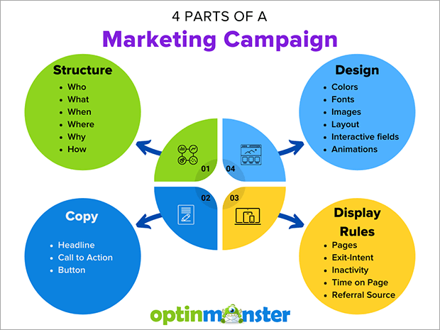
There are 4 main parts in any good marketing campaign:
1. Structure
The structure of any campaign answers these basic questions:
- Who are you marketing to? Your target audience should be specific and prepared to hear about your offer.
- What are you offering? This could be a product, service, free newsletter, discount, or any invitation to interact with your brand more.
- When are you marketing this offer? Marketing campaigns can happen just once, recur seasonally, or run all the time.
- Where are you marketing this offer? Campaigns can be displayed on your website or social media, at your physical location, or in other media platforms.
- Why would the customer want this offer? You know what you want the customer to do, but what does the customer get out of your offer?
- How can the customer take action? They can buy, subscribe, book a service, visit your location, or schedule an appointment.
2. Design
These are the visual elements of your marketing campaign. Thoughtful visuals can enhance your marketing message. Sloppy design can turn visitors away from your campaign, or even make it difficult for interested customers to respond. Design elements can include:
- Colors
- Fonts
- Images
- Layout
- Interactive fields
- Animations
3. Copy
Copy is the written text in your marketing campaign. Typically, copy is meant to persuade the reader to do something. That might be purchasing a product, subscribing to an email list, or downloading a lead magnet.
Most marketing campaigns have short copy. The goal is not to write a textbook about a subject, but to move someone to action. Here are some copy elements your campaign might have:
- Headline: This is usually the largest, most heavily emphasized line in the text. It should catch the reader’s attention.
- Call to action: The invitation to buy, sign up, or take other action should be clear and convincing.
- Button: Effective button text can reinforce the call to action and headline.
Check out our list of high quality copywriting templates for more tips on writing marketing copy.
4. Display Rules
It’s easy to forget this final piece of the campaign, but it connects back to the original structure we discussed above. The best marketing campaigns are very precise in who sees them and when they appear. Display rules mean that the most prepared and eager customers see campaigns created just for them. It’s easy to assume that more views means more conversions, but it’s often better to show a highly targeted and optimized campaign to 10 users than a generic, unmemorable campaign to 100 users.
How are you supposed to create these amazing campaigns all by yourself?
Don’t worry! OptinMonster’s Playbooks take out the guesswork from creating marketing campaigns.
Playbooks are pre-made campaigns inspired by successful brands across many industries. The structure, design, copy, and display rules have been tested and proven to work.
You can implement Playbooks quickly and easily without hiring a marketing consultant or developer. Playbooks are included in all OptinMonster plans, along with dozens of templates, a builder for custom campaigns, and tons of resources for crafting effective marketing campaigns.
Examples of Best Marketing Campaigns
Now let’s look at some of the best marketing campaigns for inspiration. We’ll break down the 4 parts of each campaign: structure, design, copy, and display rules.
1. Burt’s Bees
Structure:
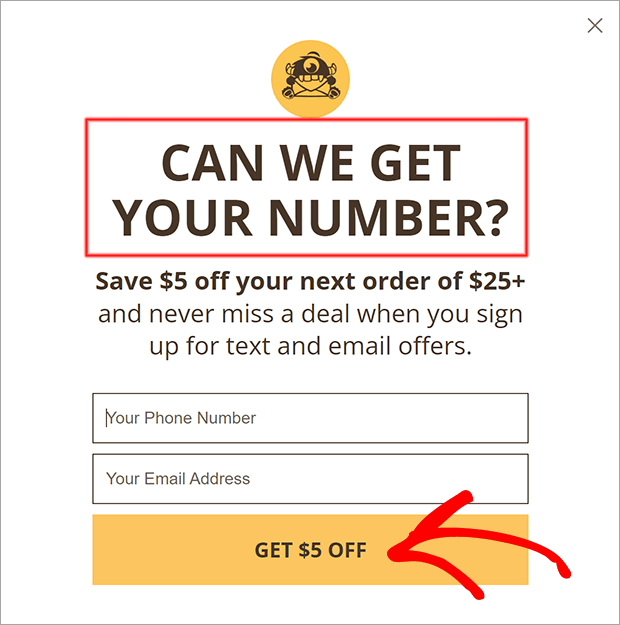
This campaign is targeted toward website visitors who are about to exit. The campaign promises a discount in exchange for subscribing to email and text marketing. There are just 2 fields for phone number and email, which may feel less intrusive than asking for their name.
Design:
The design is simple with just 2 brand colors on a neutral background. A single column layout directs the eye straight to the optin fields with no fluff or distractions.
Copy:
The headline, “Can We Get Your Number?” is playful while still asking permission to contact them. The button copy, “Get $5 Off” is more compelling than “Subscribe” or “Sign Up” because it reminds users what they get in return.
Display Rules:
This campaign is a perfect example of OptinMonster’s Exit-Intent® Technology. Waiting to display the popup until users are about to leave ensures a less disruptive browsing experience.
2. Menchie’s
Structure:
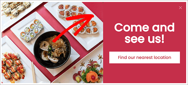
This campaign is designed to bring people to a physical store. The call to action is very easy and low-stakes. There’s no purchase or subscription needed, just a quick click.
Design:
The colorful food photography catches the eye and helps the viewer imagine themselves in the restaurant. The color of the table in the photo matches the background of the copy area. This leads the eye from the photo to the call to action.
Copy:
The headline “Come and see us!” is a warm invitation. The button copy “Find our nearest location” is simple and doesn’t pressure the visitor.
Display Rules:
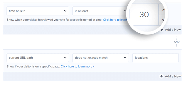
This campaign displays to anyone who has been on the site for more than 30 seconds. The only exception is any visitor who is already on the page showing the locations. It’s important to be aware of your visitor’s behavior so that you don’t show them something they’ve already seen.
3. Bliss
Structure:
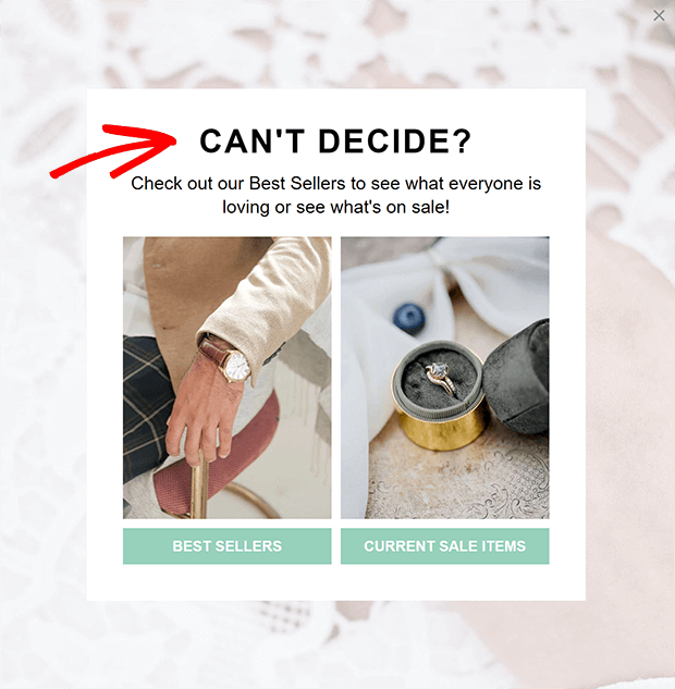
This campaign is designed to redirect visitors to high-converting pages. It can also reduce bounce rate and abandonment. The campaign narrows down the many options on an eCommerce website to just 2 pages: bestsellers and sale items. The visitor still gets to choose what they see, but it’s a much easier choice.
Design:
The 2-column design visualizes the simplified decision. There are just 2 buttons to click on. The images clearly display some of the store’s products. By pairing product images with the labels “Best Sellers” and “Current Sale Items,” the campaign builds curiosity about what else is on sale or popular.
Copy:
The headline “Can’t Decide?” mirrors some of the indecision a visitor might be feeling. The copy on the buttons tells visitors exactly where they’ll be taken when they click.
Display Rules:
This campaign uses OptinMonster’s InactivitySensor™ and displays when the visitor has stopped clicking or scrolling for at least 20 seconds. Inactivity is an indirect way to measure wandering attention or indecision. The campaign tries to regain the visitor’s attention and help them decide what action to take next.
4. Flywheel
Structure:
This is another redirection campaign. The campaign offers related content to visitors who have read most or all of a blog post and might want to see more. The buttons redirect to another piece of content or close the campaign. Redirecting to related content is a good way to keep visitors on your site longer. Once someone has read several blog posts or pages, they’re more likely to take another action like subscribing or purchasing.
Design:
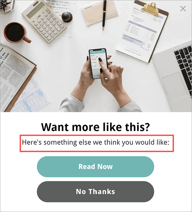
The simple 1-column design leads the eye straight to the action buttons. The positive action is colored brightly while the optout button is darker and neutral. This is a subtle way to nudge the user toward saying yes while still being transparent about their options. We never want to trick users into saying yes. Some colors in the image echo the brand color of the buttons, creating a cohesive visual.
Copy:
The headline “Want More Like This?” and copy “Here’s something else we think you would like” softly suggests related content. This is a warmer invitation than something like, “Read More Now!” which is better suited for button copy. The optout button is a polite “No Thanks” that keeps the pressure off.
Display Rules:
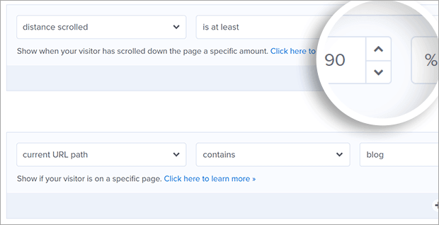
This campaign displays when a user has scrolled at least 90% down a post. This indicates that they’ve read or at least glanced at the majority of the content and might be interested in other posts. There’s also a page-level display rule that targets only pages with /blog/ in the URL. This campaign only appears on blog posts.
If you’re using the OptinMonster WordPress plugin, you can refine this rule even further by only displaying this campaign on specific categories. Then you can redirect visitors to posts in those categories. The more targeted your campaigns, the more effective they’ll be.
5. Jenna Kutcher
Structure:
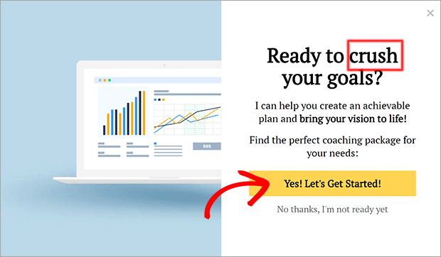
This campaign looks like another redirection campaign, but invites visitors to book a coaching package. This is a much stronger call to action than reading more content or even joining an email list. Visitors who see this campaign should already be considering coaching services.
Design:
The image shows graphs that are trending upward. This suggests growth achieved through the coaching packages. The button is boldly colored with high-contrast text.
Copy:
The copy uses stronger, more emotional language to call users to a bigger action. The phrase “crush your goals” in the headline is much more provoking than something than “book a coaching package.” Words like “achievable,” “vision,” and “perfect” inspire the reader to say yes. The optin button copy is enthusiastic and action-oriented with “Let’s Get Started!” The optout copy acknowledges a valid objection that customer might have.
Display Rules:
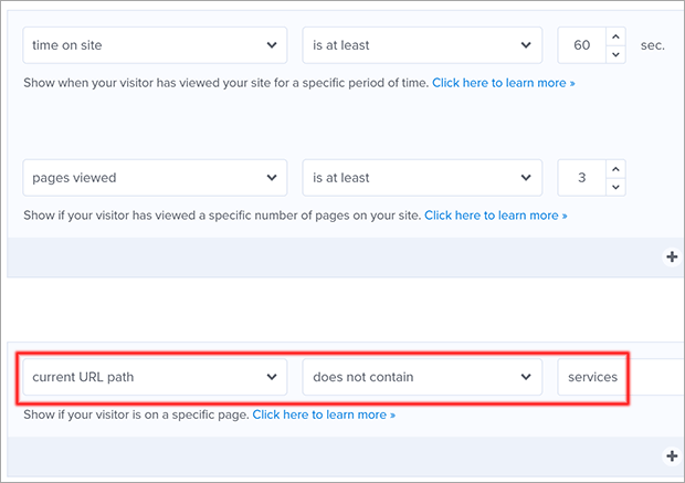
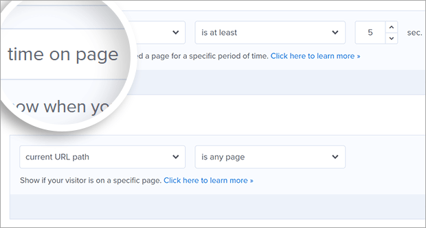
Coaching packages are an investment, so this campaign is less appropriate to show to casual visitors. To find the most interested visitors, we’ll use time on site or pages viewed. If someone has spent more than 60 seconds on the site, or viewed more than 3 pages, it’s safe to guess that they’re somewhat interested in coaching packages. Finally, we don’t want to show this campaign to someone who’s already browsing the services page, so that URL is excluded.
6. Food for the Poor
Structure:
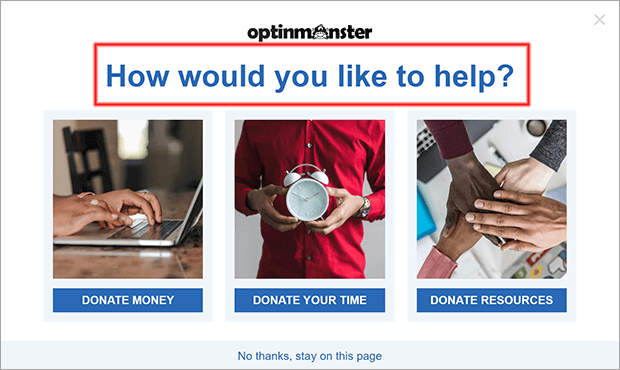
This nonprofit marketing campaign shows targeted content as a way to reduce abandonment and increase conversions. It presents 3 options to visitors about to leave the donation page. The campaign appeals to visitors who want to give but aren’t sure how. By reminding them of different ways to contribute, the campaign can help the nonprofit convert more visitors to donors and volunteers.
Design:
The headline stretches over 3 columns, visually indicating that all 3 ways to help are equally important. The images reinforce the calls to action, while the optout link is smaller but still easy to find.
Copy:
The headline “How would you like to help?” gently assumes desire to help without being pushy. The buttons all use the word “Donate,” which can help visitors feel like whatever they can give is valid. The optout “No thanks, stay on this page” offers visitors a guilt-free way to close the campaign any time they want.
Display Rules:
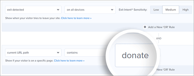
The display rules for this campaign are intentionally targeted. Visitors on any of the pages or posts related to donation will see the campaign as they’re about to exit. It’s a last-second invitation and reminder that their contribution matters.
7. WPBeginner
Structure:
This blog campaign is designed to grow their social media list. Anyone from casual readers to existing subscribers can join the Facebook group. The offer is free with a low barrier to entry.
Design:
The simple vector image contains bright colors that catch the eye. The button uses the Facebook logo and blue color to borrow brand recognition from the social media platform.
Copy:
The headline, “Want to learn from the experts?” appeals to the user’s desire for experienced and knowledgeable support. “Join the conversation” is a preview of what they can expect from the group. And the word “free” is always a good reminder.
Display Rules:
This is a fairly broad campaign, so it’s displayed to anyone who is on any page for more than 5 seconds. You could combine this rule with referral targeting to exclude anyone coming from the social media platform. This assumes that anyone referred from that platform is already a member of the group and doesn’t need to see this campaign.
How Do I Create a Great Marketing Campaign?
Replicating one of the best marketing campaigns is easy with OptinMonster Playbooks.
First, log into OptinMonster. You’ll be taken to the Dashboard.
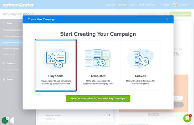
Click on Create New Campaign.
Click on Playbooks.
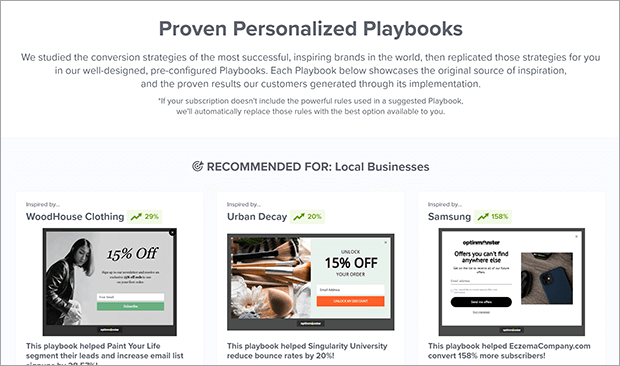
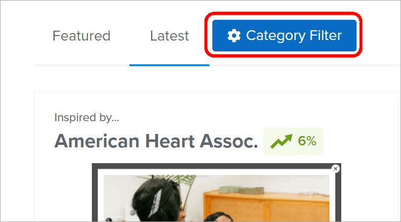
You’ll see a variety of Playbooks you can choose from. You can browse on your own or filter by goal and industry. Let’s look for something to help us show targeted offers.
Click on Category Filter.
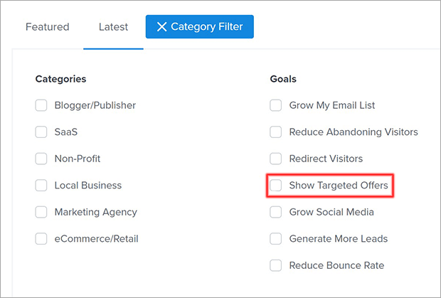
Check one of the goals or categories. In this one, we chose Show Targeted Offers.
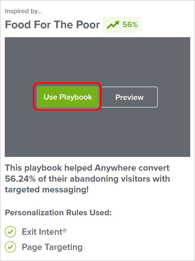
When you see one you like, click on Preview if you’d like to take a closer look. Otherwise, click on Use Playbook.
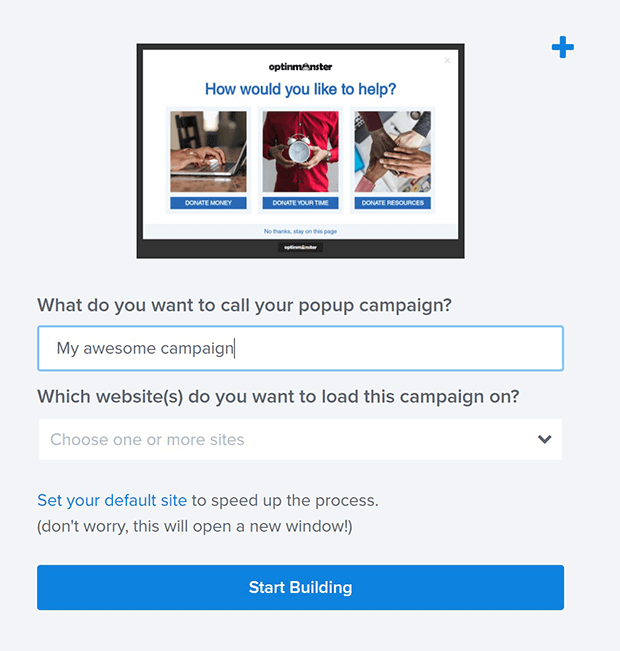
Give your campaign a name and choose which websites to display it on.
When you’re ready, click on Start Building. You’ll be taken to the Builder where you can customize any element you’d like. Remember, all of the elements have been tested and proven to work. You probably just need to adjust the copy and design slightly to match your branding and business model.
Thanks for reading our picks for the best marketing campaigns!
If you want more marketing inspiration, check out our gallery of Exit-Intent® Popup Examples and list of exit popup hacks.
Ready to get started with these and dozens of other Playbooks? Sign up for the premium lead generation plugin today.
If you like this article, please follow us on Facebook and Twitter for more free articles.










Add a Comment